3 Essential Features of Good Comics
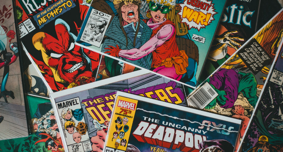
Comics are many different things put together in order to tell a story. They have pictures and words, they can be short, mid-sized, or long, and they can take on several forms. Usually, the long and beautifully illustrated comics are immensely popular among the masses.
What people often forget is that there are smaller comics or comic strips that can make a significant impact. This is why they’re used in newspapers, magazines, and in social media campaigns on the internet. There are three essential features that are the highlights of good comics:
1. Interaction of text and image
One of the most valuable aspects of comics is the text and image interaction. Some comics don’t use text. Such works of art may look aesthetic, but they miss their soul. To create meaning and send the message across, comics must have that wonderful combination of text and image.
On the other hand, there are certain situations when an image is enough to convey the message. One good example would be an image that shows a rising sun. It need not have any text to show that the sun rises the next morning. Punchlines can be used for fun or to convey a serious message.
Usually, they’re utilized for the climax and can be brutal, silly, sad, or romantic. Funny punchlines entertain and also convey an important message at the same time. The word ‘comics’ itself is funny, as it is derived from the Latin ‘comics, which translates as ‘of comedy’.
2. Panels
Panels are one of the things that are unique to comics. They are either square-shaped or rectangle-shaped frames with the related text and images. One of the major functions of panels is to show the sequence of events. They also organize the assorted bits of the comics or comic strips.
It is always the intention of the makers of comics to keep the readers engaged. So, they are used mainly as a tool for character development, action, and pacing. It may happen that the reader doesn’t notice the panels while going through the text and images. This is when the comic is considered to be a real success.
In no way does this mean that panels must not be used. They have to be used, as panels are what makes one feel that he or she is reading comics. They’re an essential part of the overall comic-reading experience.
3. Sequence
When reading comics, readers always move through the panels in a sequential manner. This can be understood from an example. Consider this sentence – ‘He picked up an apple and then a pear and then a plum’. This is all text, but the reader moves through the words in order while reading. For easy comparison, consider the names of fruits as panels and the word ‘then’ as the spaces between them.
This is exactly how the sequence works in both comics and prose. It tells the story without causing any inconvenience to the reader. Sometimes, the sequence of events has to be broken by inserting a frame that refers to a past event. However, this doesn’t create confusion, as it’s always explained with the text in a square or rectangular box.
